CO2 emissions account for the majority of global warming.
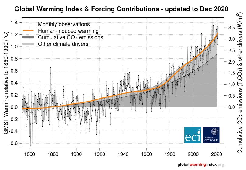
In simple terms carbon dioxide and other greenhouse gases act like a blanket or a cap, trapping some of the heat that Earth might have otherwise radiated out into space. The link between the CO2 parts per million level and rise in global temperature can be seen here.
The Climate Clock answers the question: given the current trend of global CO2 emissions and the level of human-induced warming, how long will it be until we emit enough to cause global temperatures to reach 1.5°C?
And here’s an interactive graph which goes even further back to 1000AD to show the temperature anomalies (including the 16th century mini ice age).
You can also use the hamburger menu symbol (top right corner of graph) to show CO2 levels, NO2 levels and O2 levels as well as Global sea levels.
Have a play….
To focus a bit more on CO2…..
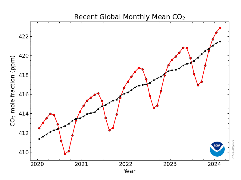
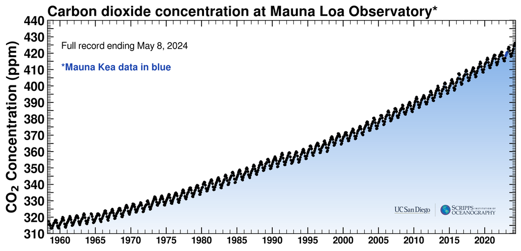
Here’s a couple of charts (updated monthly) to show the Atmospheric CO2 parts per million which are taken at Mauna Loa Observatory, Hawaii (19.5 °N, 155.6 °W)
The Scripps CO2 program was initiated in 1956 by Charles David Keeling and operated under his direction until his passing in 2005. It is currently being continued by Ralph F. Keeling, who also runs a parallel program at SIO to measure changes in atmospheric O2 and Ar abundances (Scripps O2 Program).

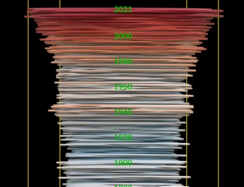
And here’s a powerful visualisation of how the monthly CO2 data has increased since 1958 to now be more than 50% more that pre-industrial levels.
The jagged/wavy red line visualizes natural oscillations caused by plant growth cycles, while the adjusted/straight red line demonstrates the steady increase over time that is caused by human activities, such as the burning of fossil fuels.
To illustrate the significance of the steady increase of atmospheric CO2 since 1958 and to provide a visual understanding of the monthly average CO2 values as they are measured in parts per million (ppm):
- Monthly CO2 values are plotted on the range of [0-500] ppm over the period of March 1958 to December 2021 (present).
- The pre-industrial CO22 average of 278 ppm is marked as an orange block.
- As time passes the monthly adjusted percent increase is calculated relative to the pre-industrial CO2 value of 278ppm and is shown next to a red arrow.
As the timeline unfolds, we can see an increase growing from 13% in March 1958 to more than 50% in December 2021.
Immense thanks to NASA Visualization Studio for allowing us to use these trackers.
We are also tracking here how for the UK how the mix of electricity generation has changed over the years from 2012 to the current date, . Importantly you can see coal has been gradually replaced by the more planet friendly gas and renewables.
If you want the current live mix then click here, and click here for a more detailed look at the last 12 months
Immense thanks to Dr Andrew Crossland for allowing us to use these trackers.
If you enjoyed reading this, the please explore our other articles below: