

Here’s a really excellent tracker which gives quick overview of the live electricity mix, carbon emissions and the amount of low carbon electricity. Immense thanks to Dr Andrew Crossland for allowing us to use the tracker and also various other Carbon Use Trackers and Renewable energy information.
As well as showing how much of the current energy is being generated from Solar, Wind, Gas etc you can see the progress we are making as a country towards our 2030 target of reducing the 1990 CO2 emissions by 57%, enroute to the legally binding target of net-zero emissions by 2050.
And we also have a rolling 28 day tracker to show the make up of our electricity (and also the typical mix in a 24 hour period) here

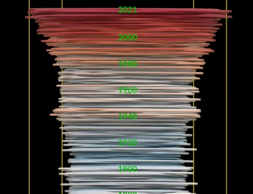
Viewing live electricity is interesting in itself, but there is much insight in looking at the trends in electricity supply and demand over time. Click here to look back over the last 12 months of electricity so you can see to a small degree how this year compared to last year (and a lot of other really interesting CO2 emissions data). And click here for a longer term overview of how the mix has changed since 2012.
If you enjoyed reading this, the please explore our other articles below:

This is an interesting Web page and I appreciate the insight that it provides. However, I have watched it for a few weeks and I am not clear as to the way Imports/Exports feature in the calculation. Exports appear to be treated as if they were ordinary UK consumption and their carbon effect is part of the carbon calculation. However, imports also seem to receive a carbon allocation. So, if UK was exporting 2 GW and importing 2GW, then 4GW of carbon effect seems to feature in the calculation algorithm. That appears to be double counting and for carbon equivalence then nett import/export would appear more logical. Then for imports, much of the energy is from Norwegian Hydro and French Nuclear and I wonder how you conclude carbon equivalence from those imports. Please keep up the good work